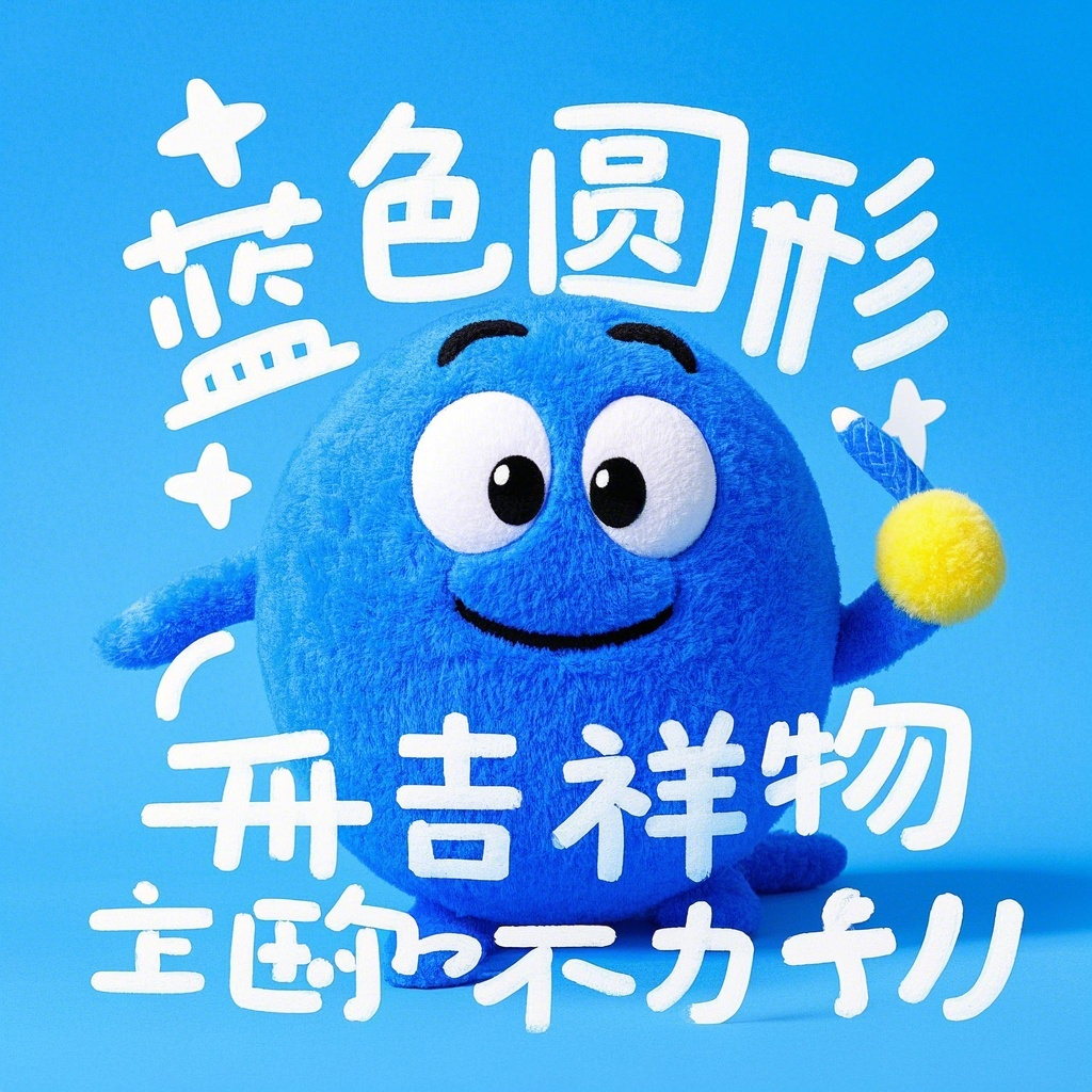
You know that feeling when you see a rotund, azure-hued character grinning at you from a screen or product packaging? Whether it’s the time-traveling robotic cat from Japanese pop culture or the cheerful beverage mascot winking from a billboard, these “blue round mascots” have burrowed their way into global consciousness. But why do these spherical cerulean figures resonate so deeply across ages and borders? Let’s unpack the science, psychology, and cultural alchemy behind their staying power.
1. The Psychology of Roundness: Comfort in Curves
Human brains are hardwired to associate rounded shapes with safety. Sharp angles trigger subconscious alerts (think: warning signs or predator teeth), while curves mimic maternal silhouettes and harmless objects like pebbles. This explains why characters like the beloved Doraemon—with his pill-shaped body and lack of edges—feel instantly approachable. A 2018 UC Berkeley study found that participants rated circular logos as 34% more “trustworthy” than angular designs. Brands exploiting this bias? Think WhatsApp’s notification bubble or Twitter’s pre-Musk bird logo redesign toward softer contours.
But here’s the twist: Blue’s cool-toned neutrality prevents these mascots from becoming too saccharine. Unlike aggressive red or childish yellow, azure strikes a balance between reliability (corporate vibes) and whimsy (imagine a sky-colored beach ball). It’s the visual equivalent of a firm handshake followed by a conspiratorial wink.
2. Cultural Chameleons: Adapting Across Borders
Japan’s “Blue Ambassador” Doraemon offers a masterclass in cross-cultural flexibility. Originally a manga character solving schoolyard problems with 22nd-century gadgets, he’s been reimagined as:
- A STEM education advocate in Vietnamese textbooks
- A climate change awareness symbol in UN campaigns
- A viral TikTok filter merging Edo-period art with holograms
This adaptability stems from deliberate design choices. The absence of realistic human features (no specific ethnicity/age) allows projection of diverse narratives. Contrast this with Mickey Mouse—inescapably tied to American mid-century aesthetics—and you’ll see why blue spheres travel better globally.
3. The Silent Salesman Effect: Branding Beyond Logos
Corporate marketers have weaponized this formula. Examine the evolution of Bonzo the Dog (1920s British cartoon) versus modern counterparts like the Duolingo owl:
- 1920s Approach: Static illustrations + basic color blocks
- 2020s Strategy: Fluid animations reacting to user behavior (e.g., the owl crying if you skip lessons) + “Blue Hue #2980B9” optimized for retina screens
A beverage company’s 2023 A/B test revealed that rounded blue mascots increased cart conversions by 11% versus geometric logos. Why? They trigger what neuromarketers call the “Teddy Bear Effect”—consumers unconsciously assign empathetic traits to circular forms, viewing them as patient listeners.
4. The Uncanny Valley Dodge
Ever noticed how most blue mascots avoid realistic human proportions? There’s method in this madness. As robotics professor Masahiro Mori theorized, entities appearing almost human (like wax figures) creep us out. By keeping features abstract—oversized heads, minimal facial details—designers sidestep this discomfort. The Michelin Man evolved from a grimacing tire stack to a smiling puffball precisely to avoid unsettling viewers.
5. Nostalgia as a Growth Engine
These characters age like digital wine. When Sega revived Sonic the Hedgehog in 2020, they didn’t just update graphics—they leaned into millennial nostalgia through meta-humor (Sonic complaining about reboots in the script). Result? The film grossed $319 million despite a notoriously rocky production.
But there’s a catch: Over-milking nostalgia breeds resentment (looking at you, Minions sequels). The sweet spot lies in balancing legacy elements with fresh contexts—say, a classic blue mascot debating AI ethics in a YouTube short.
The Future: Holograms, Haptics, and Ethical Quagmires
As AR glasses go mainstream, prepare for blue mascots to leap off screens. Imagine a virtual Doraemon sitting on your desk, reacting to your work schedule via ChatGPT integration. Japanese tech startup AWRD already demoed this in 2023 using spatial computing headsets.
Yet looming questions remain:
- Data Privacy: Will these characters mine user interactions for ads?
- Cultural Appropriation: Can a Finnish company safely deploy a Maori-inspired blue mascot?
- Psychological Impact: At what point does algorithmic personalization (e.g., a mascot mimicking your deceased pet) become manipulative?
Final Thought
Next time you chuckle at a chubby blue character selling insurance or teaching math, remember: You’re not just seeing a marketing gimmick. You’re witnessing a century of psychological research, cultural negotiation, and technological innovation distilled into a perfectly imperfect circle. These mascots work because they mirror our deepest cravings—for comfort in chaos, continuity in change, and a friendly face in the algorithmic wilderness. The real magic? They make us forget they’re engineered to do exactly that.
Now, here’s a question to ponder: If these icons evolved to reflect humanity’s needs, what might future mascots look like as we grapple with AI existentialism and climate grief? Food for thought—preferably served in a round blue bowl.
原创文章,作者:Z,如若转载,请注明出处:https://www.ctrlz1.com/?p=1227